Northbrook Park District
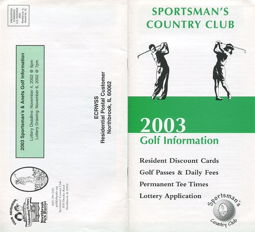
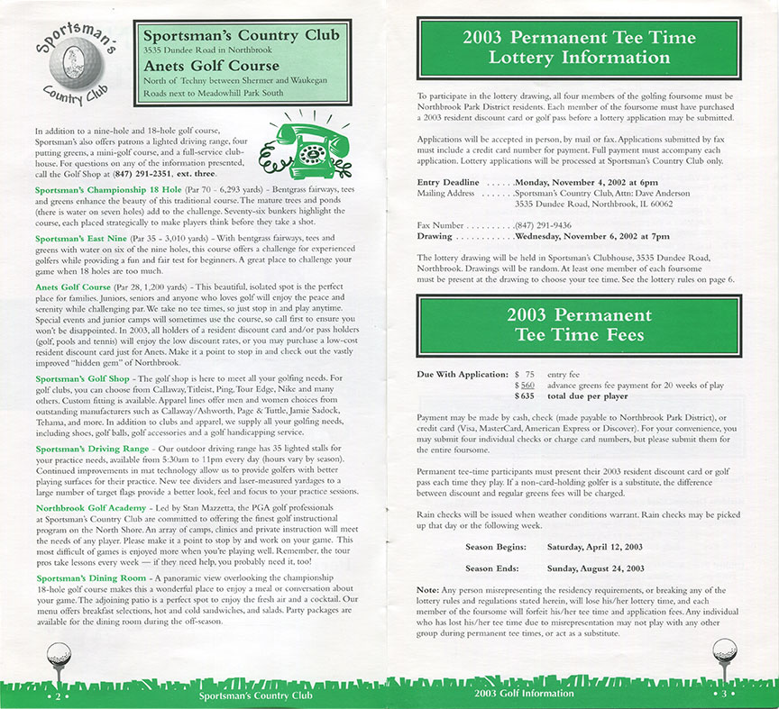
I did some minor freelance work for the Northbrook Park District back in 2003. For this particular project, I was tasked to do a facelift for the Sportsman's Country Club yearly brochure. Sent to all Northbrook residents, the focus here was to enhance something that was previously just functional. They favored the use of clip art and I subtly added a golf motif, while tightening up typography to convey more elegance. If I recall correctly, this was a QuarkXPress document (which is Adobe InDesign's very antiquated predecessor).
Carol Stream Park District
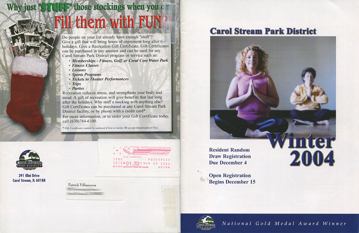
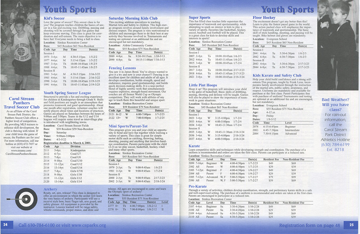
A project while at Artistic Digital Services, I was brought in to help typeset brochures. The Carol Stream Park District's seasonal catalog was an existing Quark project, and I was assigned to update copy and make things fit accordingly from one page/spread to the next. What I recall is altering the leading, sometimes kerning, or even font size to make it all work. It was 48-pages in length.
Clark Consulting
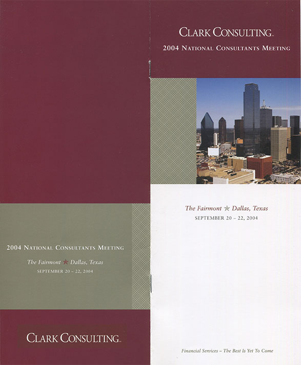
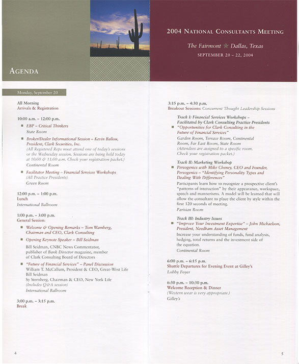
Production work at Hans Design, Clark Consulting's annual conference brochure was yet another Quark project. The assignment was more practice with character and paragraph styles, setting up documents for print (i.e. page bleed, CMYK verification, 300dpi), and getting used to the studio/client approval process.
Acco
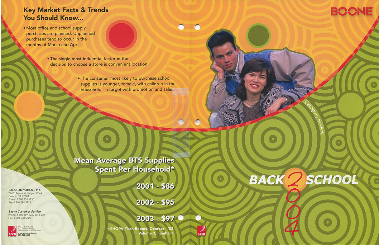
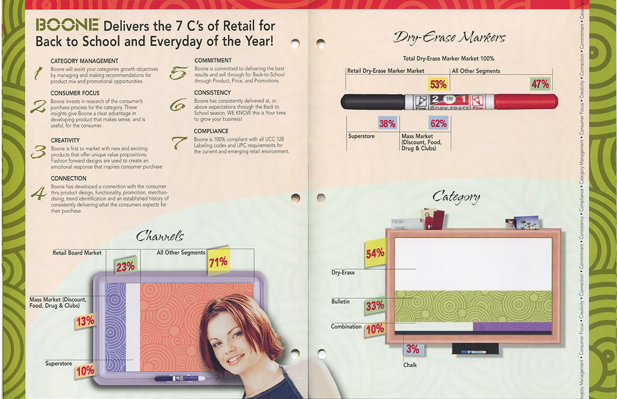
Another Quark project at Artistic Digital Services, this was more production work. Because product images were involved, we cleaned up imperfections with masterful Photoshop techniques. I recall importing Illustrator vector images and lining up the patterns with precision. Because typography/typesetting is a strength of mine, I was once again tasked to tighten up what was previously wonky.
Augustino's
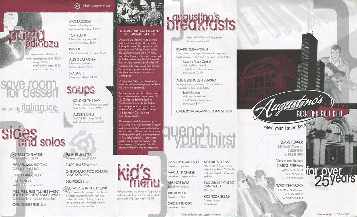
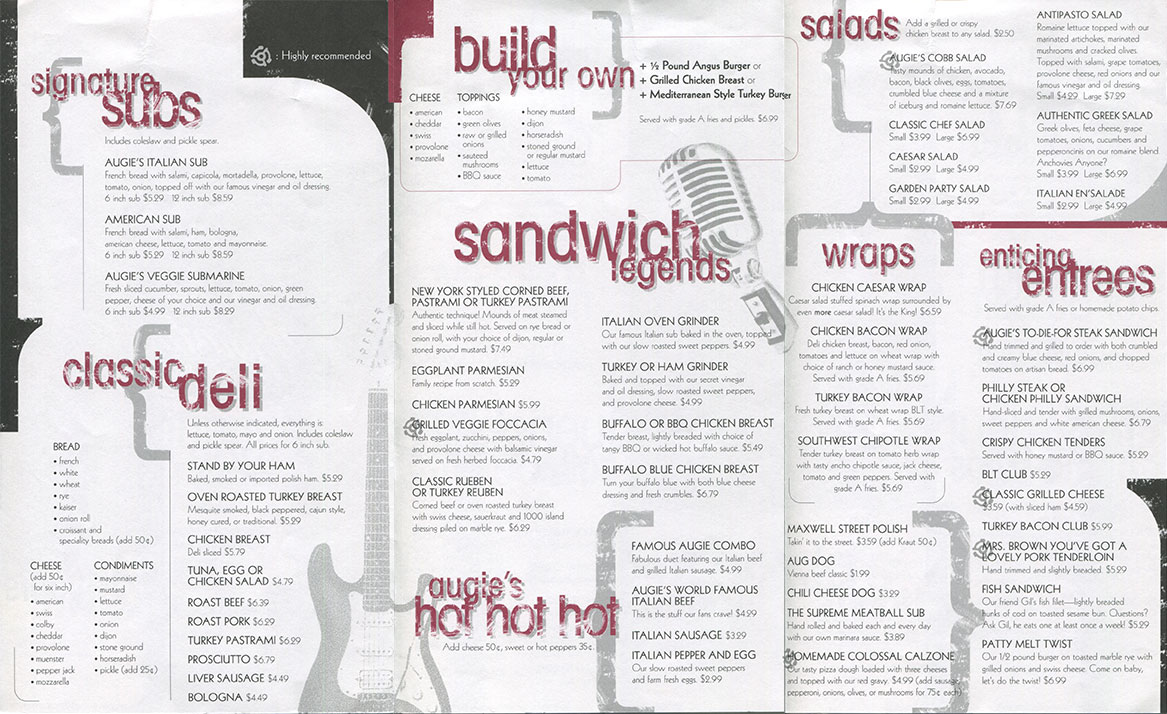
An early project at Blueprint Design Studio, the menus for Augustino's Rock and Roll Deli were in need of a redesign. What I recall from the old printout was how their entire menu was extremely cramped, and it was a natural request to make it larger. The restaurant carries a rock and roll theme, and I thought it was appropriate that that would be evident in the menu design. Some of their iconic statues were implemented, as was introducing other complementary graphics to reinforce the brand and to visually separate menu sections. I chose to use a 45 rpm adapter to denote popular items, as more of a subtle tie-in to their logo. This remains to be one of my favorite designs I've worked on. Even better, our client was very happy with the result. By this time, Adobe InDesign surpassed QuarkXPress as the industry standard and was used for most printed pieces at Blueprint.
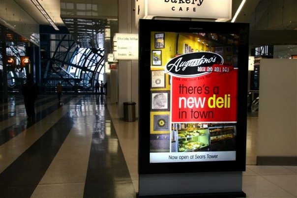
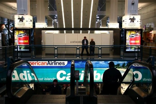
Augustino's is based in the west suburbs, but their third location was opened at the then-named Sears Tower. The menu redesign preceded the grand opening, and the owner requested a poster to promote their new location. Cathy wanted to display these at the Ogilvie Station downtown, and they secured two very visible spots for commuters to see. I cannot remember all the parameters, but the tagline and logo needed to be prominent. Their new location needed to be somewhat clear, and that left some space to bring the ambiance/brand to the piece itself. I further established their new designs by using the same font used for their menus – Futura.
Brazzaz
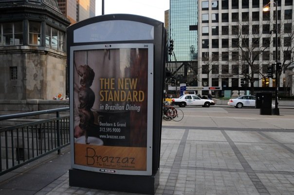
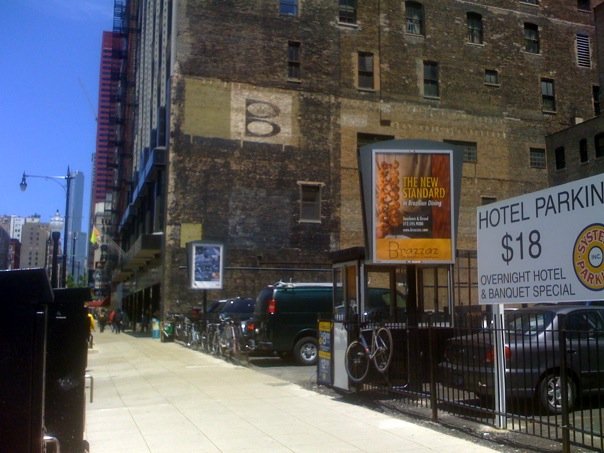
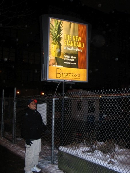
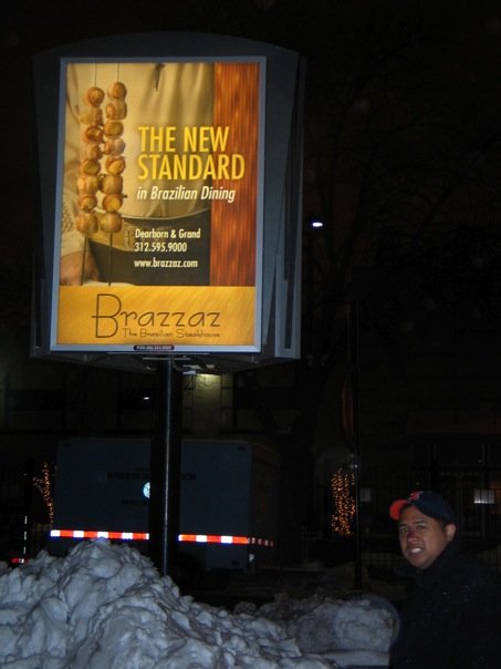
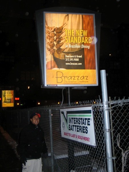
Brazzaz, The Brazilian Steakhouse, in Downtown Chicago was probably one of my bigger assignments. I was tasked to redesign their posters and printed marketing pieces. Brazzaz was very aggressive with their advertising, who had a number of the billboard spaces reserved throughout the downtown area. The old poster was simple, highlighting the various entrees on skewers and a logo that was oddly placed. Our photography crew wanted to reshoot the images to partially include the gauchos (servers). Since the focus was more of the photo, I complemented the layout with some of the restaurant's colorful and very chic ambiance. It helped to re-establish the restaurant brand and boost customer traffic.
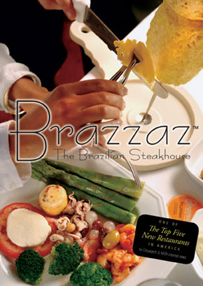
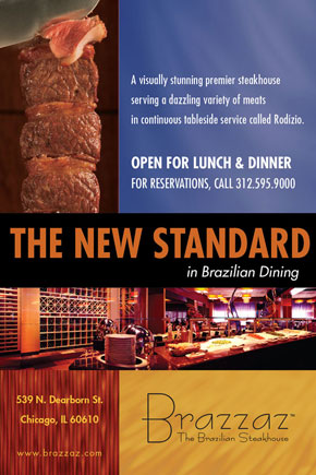
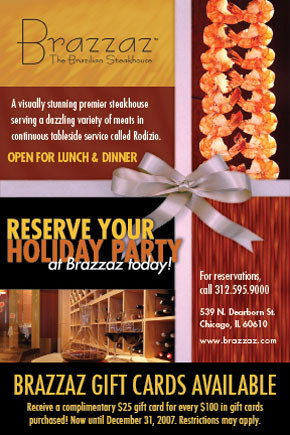
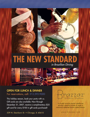
Brazzaz also advertised in a number of magazines and had postcards included in promotional mailers. These were a few of the favorites I worked on. It carried more of the same motif to echo the posters and restaurant ambiance.
Indian Trails Public Library
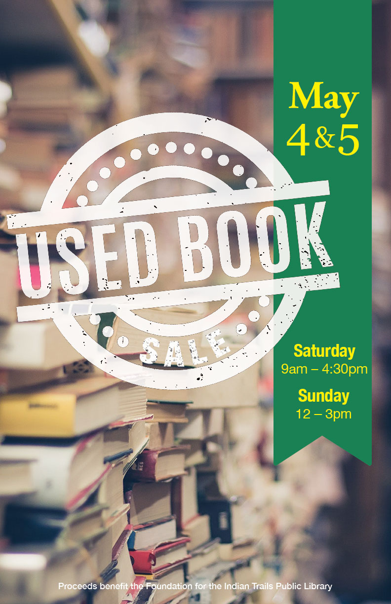
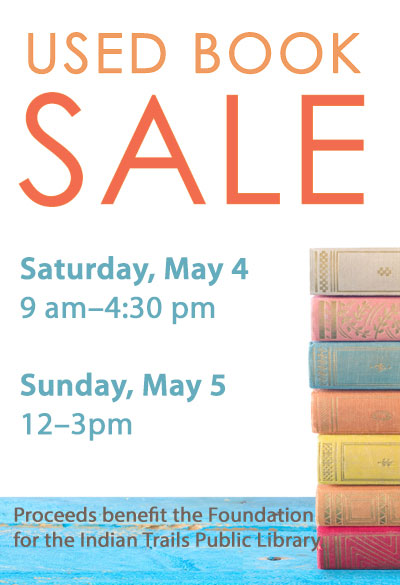
This was a concept that I explored the other month. I saw their completed design and wondered what I would do instead. The old layout was straightforward, more about the included type than the image and without much layout hierarchy. I thought an image could be brought to the forefront, and to treat the event title differently - in this case, a rubber stamp treatment. To tie in the rest of the info, I used a ribbon-like bookmark to assure legibility.